A suggested change to our symbol
Please Log in or Create an account to join the conversation.

Just kidding, looks no good

極代 ~ per ardua ad astra
Please Log in or Create an account to join the conversation.
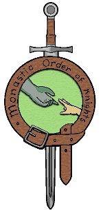
If we are going to be doing changes, perhaps we can work on a HD copy of the logo? The one we have is good, but still rather pixelated.
Sponsored by Wescli Wardest
//Arisaig's IDP Journal\\
Please Log in or Create an account to join the conversation.
Please Log in or Create an account to join the conversation.
River wrote: Why reaching *down*?
hard to lead from behind.
")
Sponsored by Wescli Wardest
//Arisaig's IDP Journal\\
Please Log in or Create an account to join the conversation.
River wrote: Why reaching *down*?
Well it's two reasons. The first is that one hand is clearly reaching down in our current logo. Secondly to help someone up they must be down.
Please Log in or Create an account to join the conversation.
Please Log in or Create an account to join the conversation.
James wrote: I actually like the way it is now - we're not saying that one hand is any different from the other - it's simply two hands reaching, and having something to grab at the other side.
Not a bad point. Not sure which I like better but I do like the symbolism of my suggestion
Please Log in or Create an account to join the conversation.
- Wescli Wardest
-
- Offline
- Meister
-
- Posts: 887
- Thank you received: 1115
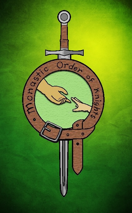
The sword was placed in the symbol to symbolize Knighthood. And it is downward facing to be non-aggressive. It is also downward facing because it forms the cruciform sword, the cross, which will cause some to be more accepting. The circle in the middle is split in two with the two fields behind the hands form a kind of yen and yang. Thus the balance of the eastern philosophy. And having the two on the same symbol is for bring the different religious views of the world together.
The sword hilt in the top of the circle forms the male symbol. The sword point, arrow, on the bottom is female. Green and brown are earth tones for nature. The belt knot and the four belt holes on that side is the four cardinal directions and the four elements. And the one hole is representative of the solo mission or life all knights may take. Also shows the possibility of growth, lengthening of the belt.
Oh, the reason the on top hand is facing up is that is a submissive gesture. IE the helping hand. The reaching hand is smaller and rounder suggesting youth or someone that may need a helping hand or guardian hand.
I know it looks ridiculously simple, but there is a lot of symbolism and thought that went in to it.
LOL

Please Log in or Create an account to join the conversation.